The Ultimate Desktop Wallpaper Checklist: 10 Things to Consider Before Choosing Your Next Background
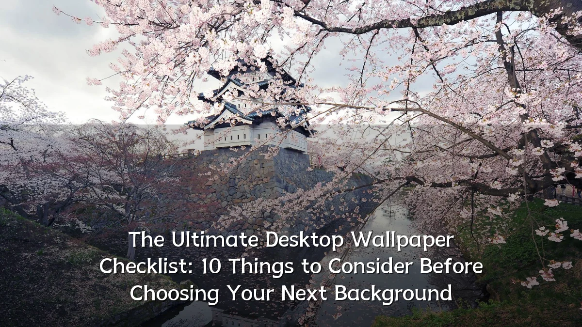
Desktop wallpapers have moved far beyond a simple decoration. With high-resolution monitors, multi-screen setups, and increased awareness of digital ergonomics, picking a background now involves screen size, color calibration, system performance, and even psychological comfort. This neutral analysis outlines the trends shaping wallpaper selection, the background factors that matter, common user concerns (including a practical 10-point checklist), likely impacts of thoughtful choices, and what to watch next in the field.
Recent Trends in Desktop Wallpaper Choices
Current trends reveal a shift toward personalization that respects both utility and aesthetics. Key developments include:
- High‑resolution and scaling – With 4K and even 5K displays becoming common, images that look crisp at native resolution are preferred.
- Dark‑mode compatibility – Many users now choose wallpapers that complement system‑wide dark themes to reduce glare and improve contrast for text.
- Minimalist and soft‑focus designs – Busy patterns have given way to subtle gradients, blurred abstracts, or solid colors that don’t compete with icons and taskbars.
- AI‑generated and dynamic backgrounds – Tools that create unique, often automatically rotated images are gaining traction, though quality varies widely.
- Multiple‑monitor awareness – Seamless panoramic or coordinated wallpapers for two or three screens are increasingly requested.
Background: Why Wallpaper Choice Matters
For many users, the desktop environment is a primary workspace for hours each day. An ill‑chosen wallpaper can contribute to eye strain, reduce visibility of icons and files, or even slow system response if the image file is excessively large. Conversely, a well‑selected background can improve focus, create a calming atmosphere, and reinforce a sense of personal ownership over the digital space. Historically, the main factors were resolution and aesthetic preference; today, considerations like color psychology, screen burn‑in prevention for OLED panels, and compatibility with window accent colors play a role.

Key User Concerns When Selecting Wallpapers
Based on common questions from desktop users, designers, and IT managers, the following checklist covers the most frequently overlooked factors. Each item addresses a specific pain point or opportunity.
- 1. Display resolution and aspect ratio – Match the wallpaper’s native dimensions to your screen’s exact resolution (e.g., 1920×1080, 2560×1440, 3840×2160) to avoid scaling artifacts. For dual monitors, account for the combined width.
- 2. Screen type (LCD, OLED, CRT) – On OLED screens, static bright elements can cause burn‑in over time; use darker wallpapers or ones with minimal fixed highlights. CRT and some LCDs may show different color rendering.
- 3. Color scheme and contrast – Ensure the wallpaper’s dominant colors don’t clash with your OS accent color or make text labels unreadable. High contrast zones behind icon areas are a common mistake.
- 4. Image file size and format – Very large PNG or uncompressed images can increase boot time and memory usage. JPEG (or WebP) at moderate quality typically balances clarity and performance.
- 5. Privacy and distraction level – Busy patterns with people, text, or logos can be distracting or accidentally reveal information during screen shares. Minimalist or neutral backgrounds reduce cognitive load.
- 6. Lighting conditions and viewing angle – A wallpaper that looks balanced in a bright room may appear too dark or washed out in a dim environment. Adjust brightness and gamma accordingly, or use a wallpaper that adapts to time of day.
- 7. Personal meaning vs. utility – Photos with strong emotional ties can boost motivation but may also cause fatigue if viewed continuously. Consider separating work and personal machines.
- 8. Alignment with OS theme – Modern operating systems allow wallpaper to set accent colors automatically. Choosing a wallpaper from which those colors are drawn ensures visual consistency across windows.
- 9. Ease of rotation or update – Static wallpaper can become stale. Many users prefer a slideshow from a curated folder with a suitable interval (e.g., 30 minutes to daily) to maintain freshness without constant manual changes.
- 10. Screen real‑estate usage – If you frequently work with full‑screen windows, the wallpaper’s visible area is small. For immersive use (e.g., design, gaming, or video editing), the entire image quality and composition matter more.
Likely Impact of Following a Wallpaper Checklist
Users who apply a structured approach to wallpaper selection typically report fewer visual discomforts, improved productivity, and a more cohesive desktop environment. For organizations, a uniform wallpaper standard can simplify support (e.g., fewer complaints about obscured icons or slow login) while still allowing some personalization within defined parameters. On the creative side, paying attention to resolution and format reduces the chance of a disappointing “stretched” appearance. In the longer term, a well‑chosen wallpaper can contribute to a more sustainable relationship with the computer—less impulse to change backgrounds frequently, less time spent searching for the next image.
What to Watch Next
As operating systems evolve, wallpaper selection tools are likely to become smarter. Look for:
- Automatic optimization – Software that detects screen resolution, color profile, and ambient light to suggest or adjust wallpapers in real time.
- Integrated AI curation – Platforms that learn user preferences for style, color, and subject matter, then generate or recommend a shortlist of backgrounds.
- Multi‑device syncing – Desktop wallpaper settings that automatically carry over to tablets, phones, and external monitors for a consistent experience.
- Accessibility‑oriented designs – Wallpapers designed with high contrast for icon labels, or patterns that reduce motion sensitivity.
By keeping these developments in mind, users can anticipate a future where choosing a background becomes more intuitive and less of a compromise between form and function.