Professional Phone Background Ideas That Make You Look Polished
Recent Trends in Professional Phone Backgrounds
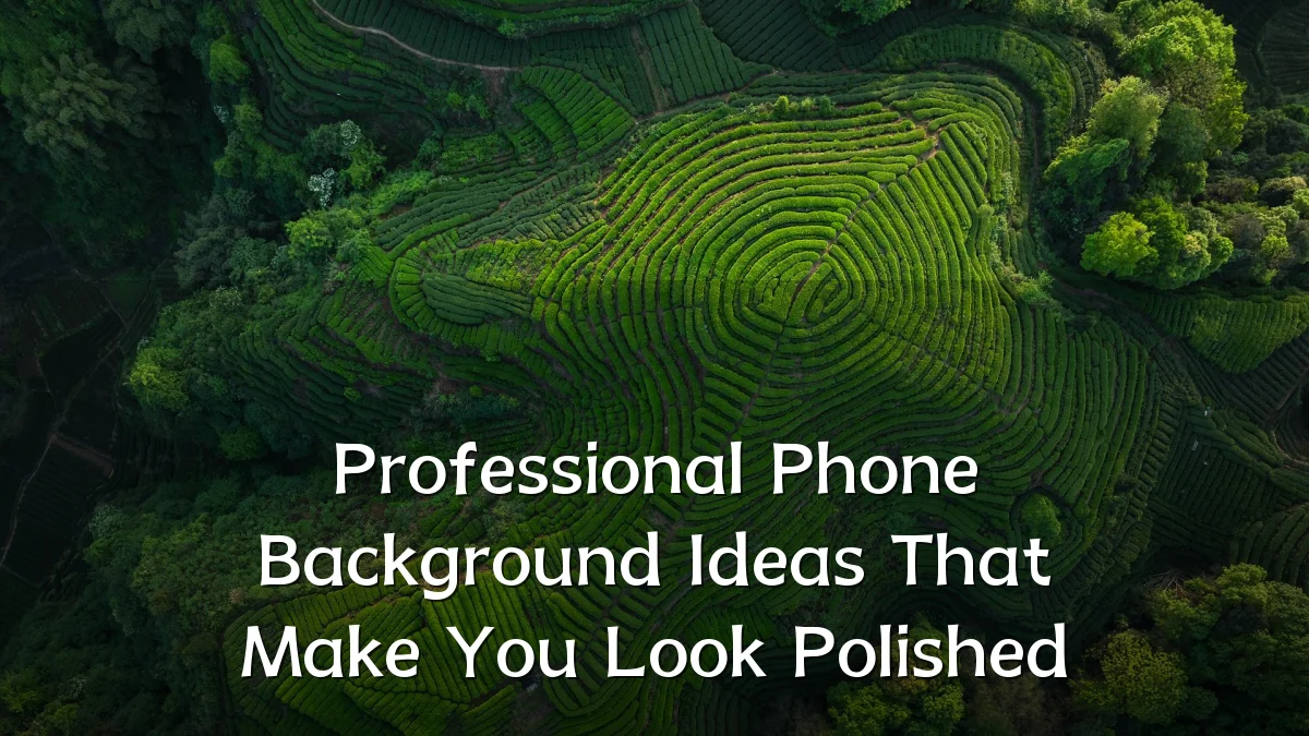
Minimalism continues to dominate workplace aesthetics, and phone backgrounds are no exception. Solid neutral tones—like slate gray, navy, or warm beige—are widely adopted because they reduce visual noise. Abstract gradients with subdued color transitions also appear frequently, as they add depth without distracting. Nature landscapes with low saturation (e.g., a soft-focus mountain horizon or a calm ocean horizon) strike a balance between personal expression and professional restraint.

- Dark mode-friendly designs with dark base layers and subtle light accents
- Geometric patterns in monochrome or muted palettes
- Subtle texture overlays (linen, leather, matte paper) to simulate physical materials
Background
The rise of remote and hybrid work has placed mobile devices in more visible settings—video calls, shared screens, and in-person meetings. A cluttered or overly personal lock screen can unintentionally shift focus. Meanwhile, many professionals have moved toward separating work and personal content, making the phone lock screen a deliberate choice rather than a default image. This shift has prompted discussions in workplace culture and digital etiquette about what reads as “polished” versus casual.

User Concerns
Common user concerns revolve around impression management, confidentiality, and practicality. People worry that a bright or meme-filled background may appear immature in client-facing contexts. Others are cautious about displaying identifiable locations, family photos, or branded materials during screen-sharing scenarios. Battery life and visibility under direct light also factor into choices: high-contrast dark backgrounds are preferred for outdoor use, while lighter, matte-toned designs work better in well-lit indoor offices.
- Will this image distract during a video call when I hold up my phone?
- Does the background leak any personal or location data?
- Is the design consistent with the company’s brand guidelines (if visible to colleagues)?
Likely Impact
Adopting a polished phone background can subtly reinforce professionalism in day-to-day interactions. For example, a neutral, non-cluttered lock screen may help a colleague or client perceive you as organized and intentional. In informal video calls where a phone screen is briefly shown, such backgrounds reduce cognitive load on viewers. There is also growing anecdotal evidence that employees in client-facing roles receive fewer off-hand comments about their personal taste when they use deliberately simple designs. The impact is likely more pronounced in small-team settings or high-trust industries where personal device use is common.
What to Watch Next
Dynamic backgrounds that change based on time of day or calendar status (e.g., “in a meeting” indicator) are emerging in productivity tools. Some professionals are experimenting with AI-generated backgrounds that match the color palette of their current workspace or brand. Integration with digital well-being features—such as grayscale lock screens that reduce screen time—could become a standard option for those wanting both polish and focus. Meanwhile, standardized workplace guidelines around phone appearance may evolve as device-shared collaboration persists.